Heuer's Cortina Chronograph
A watch for the glamour of the 70's Alps
The 1970s was a revolutionary decade for watch design, defined by the rise of the integrated steel sports watch. It was an era of bold shapes and new expressions of luxury. In this landscape, the brand Heuer had carved out a dominant identity forged on the racetrack. With legendary models like the Autavia, Carrera, and Monaco strapped to the wrists of motorsport icons, Heuer was synonymous with the smell of fuel and the roar of engines.
Against this backdrop, the company launched a watch in 1977 that signalled a deliberate and profound strategic shift. This was the Heuer Cortina, a flagship of the brand’s new “third generation” of Calibre 12 chronographs. This new wave of design consciously dialled back the exuberant, over-the-top style of the early 1970s in favour of a refined, versatile elegance suitable for any occasion. The Cortina was a fascinating and overlooked anomaly, a timepiece that deliberately turned away from the brand's motorsport pedigree to explore a different style.
Unlike nearly every other famous Heuer chronograph of its day, the Cortina had no connection to motorsports. It was not named after a race, a driver, or a car. This was the most literal manifestation of the brand’s strategic pivot. To signal its new direction, Heuer created the model to add a "winter-sports themed model" to its portfolio.
The watch was named after Cortina d'Ampezzo, the Italian mountain town in the South Tyrol, where the rich and famous would go skiing. The goal was to charm this specific clientele with a design that spoke to a different kind of sporting life. For a brand deeply rooted in the culture of the racetrack, this move was a risk.
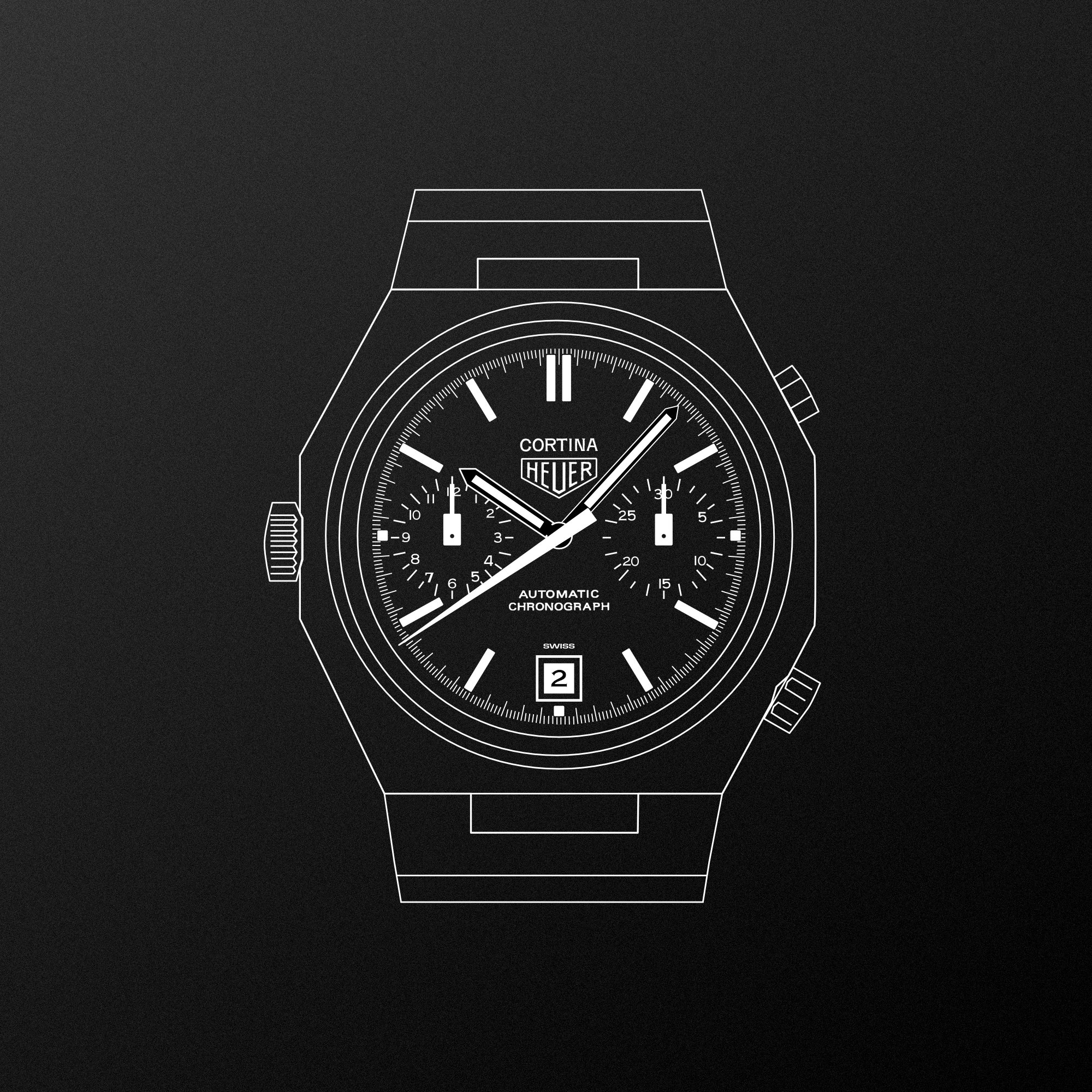
The Cortina’s defining feature is its 39mm eight-sided (octagonal) case with an integrated stainless steel bracelet. This was Heuer’s answer to the defining trend of the era, set by Gérald Genta’s iconoclastic Audemars Piguet Royal Oak and Patek Philippe Nautilus. Yet, this was a unusual choice for Heuer, a company that, as design critic Samuel of 'Watching Type' notes, “made tools, not jewellery.”
The execution was distinctively Heuer. The top surface of the case features a concentric brushed pattern that circles the dial, a finish distinct from the radial pattern found on other Heuer cases, and contrasts sharply with the brightly polished sides. While it embraced the integrated form, the bracelet itself, with its simple single links, showed a certain utilitarian restraint. This architectural quality makes the Cortina feel timeless and contrasted with another 1977 Calibre 12 model, the Heuer Daytona and its soft, pebble-shaped case. The Cortina was Heuer’s unique interpretation of high style, proving the brand could create an object of elegance through its own tool-watch lens.
While all Cortina models were distinctive, the white dial variant (reference 110.233R) stands apart as the ultimate expression of the brand’s quest for elegance. This model featured two elements unique among all Calibre 12 chronographs Heuer ever produced: a bright white enamel dial and elegant Roman numerals for hour markers. This combination created a formal, almost classical aesthetic that was a stark departure from the brand’s sporty and functional designs. Its uniqueness cannot be overstated, a point underscored by TAG Heuer's own historical archive:
If we were to line up all the Calibre 12 chronographs that Heuer produced from 1969 into the mid-1980s and ask, “Which one is different from all the others?”, the white version of the Cortina (reference 110.233R) would win the prize.
This wasn't merely a different design choice; it was a statement of intent, pushing Heuer into territory previously reserved for more formal dress watch manufacturers.
A close examination of the Cortina's dial reveals an obsessive level of care and typographic craftsmanship. The hand-rendered lettering is full of subtle features that speak to the pride invested in its design. For instance, tiny ink traps, small hollowed-out spaces, can be found inside the sharp angles of the letter 'N' in the "CORTINA" text, a feature intended to mitigate optical effects or ink pooling. As Samuel of 'Watching Type' observes 1, this detail was almost not technically necessary, it was likely the designer “showing off a little bit,” a subtle flourish that demonstrates the immense care and artistry invested in the design.
The text "AUTOMATIC CHRONOGRAPH" is skilfully hand-drawn, based on the modernist font Univers. Even the date wheel received special attention; the numerals were hand-drawn, with the numeral '2' being shaped differently in the dates 2, 21, and 22 to maximise legibility. These almost-hidden details transform the dial into a masterclass of balanced design.
The Heuer Cortina is a rare find today. As TAG Heuer’s archives note 2, "Each of the three models...was produced for a relatively short period of time." It possesses all the modern credentials for high collectibility: a Genta-era integrated bracelet design, a unique brand story, and low production numbers.
Yet, despite this, the Cortina "remains unknown and uncollected" 3 compared to its famous siblings. This creates a fascinating paradox for collectors. The obsessive, masterclass-level details hidden in its typography make its overlooked status even more perplexing. For those in the know, the Cortina represents a hidden gem—a watch with an impeccable pedigree and a singular identity that has managed to fly under the radar.
The Heuer Cortina stands as an audacious piece of horological architecture that dared to be different from the rest of the brand's legendary lineup. It traded the grit of the racetrack for the glamour of the Alps, all while showcasing a mastery of design and detail.
Illustration | Software: Affinity Order a print [+]- Watching Type (2024). Watching Type, No. 2: An ode to the Heuer Cortina. A detailed newsletter piece analysing the design, aesthetics and distinctive features of the 1977 Heuer Cortina chronograph, with commentary on its case, movement and typography of the dial. https://www.watchingtype.com/p/watching-type-no-2-an-ode-to-the
- TAG Heuer. Heuer Cortina (Vintage Collection). Official TAG Heuer heritage page describing the Cortina’s design features, historical context within the late 1970s Calibre 12 range and its rarity among collectors. https://www.tagheuer.com/gb/en/vintage-collection/heuer-cortina.html
- WatchProSite. Heuer Cortina: the relatively less well‑known all‑steel watch from the 1970s. An enthusiast overview discussing the Heuer Cortina chronograph, its place in Heuer’s vintage lineup and its unique characteristics among 1970s steel watches. https://www.watchprosite.com/tag-heuer/heuer-cortina--the-relatively-less-well-known-all-steel-watch-from-the-1970s/737.1087448.8031428/
- OnTheDash. Cortina. A brief vintage reference entry summarising the Heuer Cortina automatic chronographs introduced in 1977, including Caliber 12 variants and a later Lemania 5100‑equipped reference. https://www.onthedash.com/watches/cortina/
- Heuertime. Heuer Cortina listing. A vintage watch listing providing technical details on a Heuer Cortina reference 110.233NC including case dimensions, Caliber 12 movement, integrated bracelet and condition notes. https://www.heuertime.com/kopie-van-heuer-autavia-1163v-viceroy